
There’s a post office in Mitoyo, Japan, where people send letters that will never be delivered.
They write to those they’ve lost: to future grandchildren, to old lovers and to themselves. The official name of this place is the Missing Post Office (or Hyōryū Yūbinkyoku, ‘Drifting Post Office’).
When we read about it, we couldn’t help but think of Quinn. It felt like a story he would tell or a place that he would one day visit. A post office not for postage but for memory and longing. A repository for all the things we never got to say and feelings with nowhere else to go.
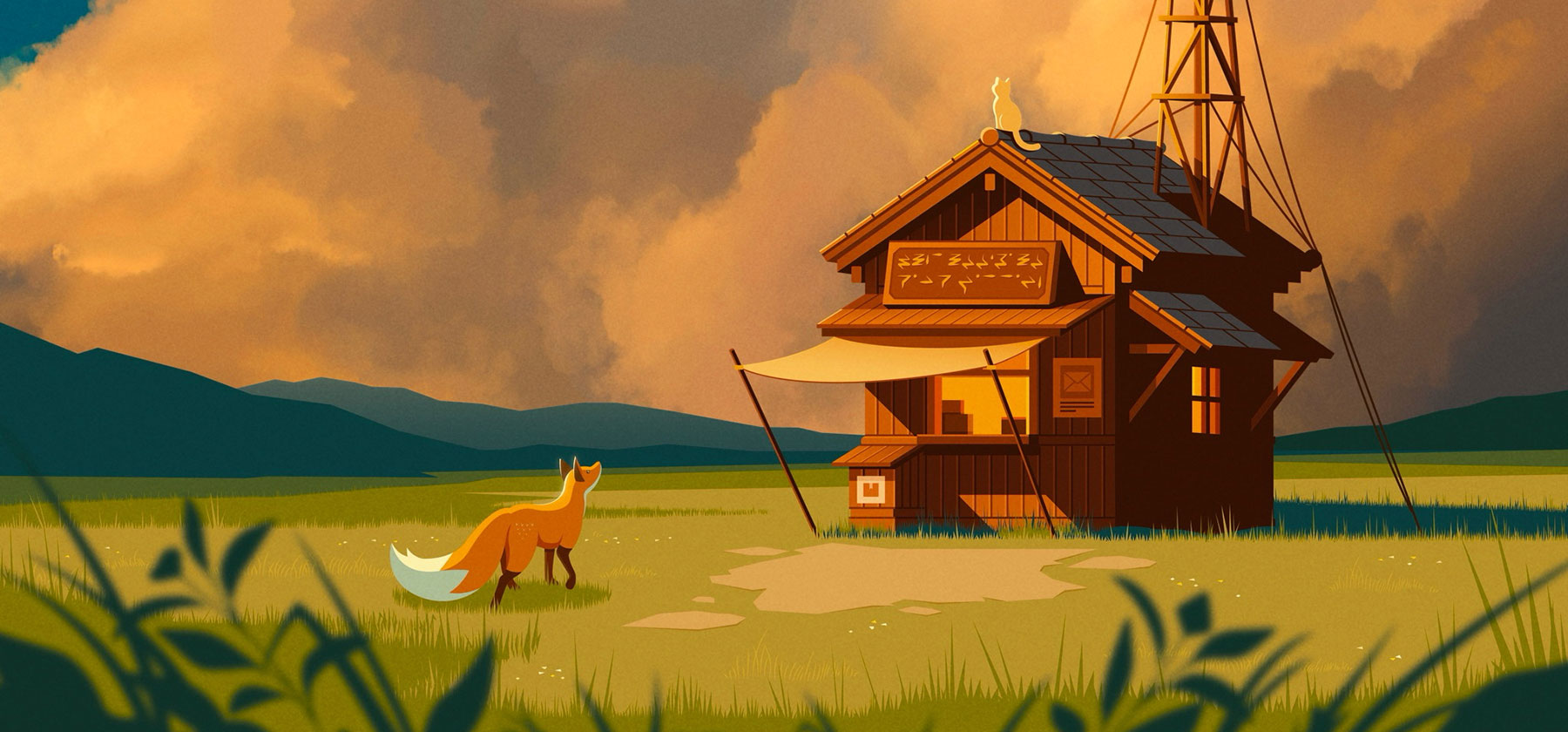
So we decided to design our own: a post office quietly tucked into the landscape of Quinn the Fox’s dream-like world, which we’ve been illustrating for over a decade.
This is how we brought the Post Office of Dead Letters to life.
Concept: The Real Missing Post Office
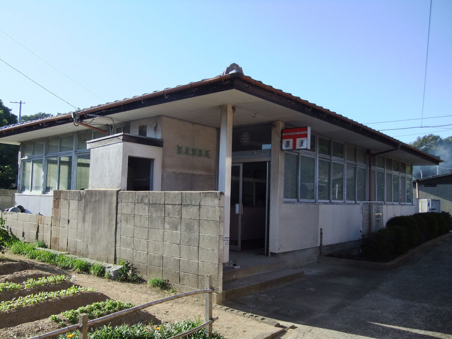
In 2013, Japanese artist Saya Kubota transformed a disused post office on Awashima Island into an art installation called the Missing Post Office. The Setouchi International Art Triennale commissioned the work as part of a contemporary art festival held across several islands in Japan’s Seto Inland Sea.
The idea was simple but powerful: people could write letters that would never be delivered. Messages to the deceased, notes to the future, unspoken thoughts and unresolved feelings were sent to the post office. Inside the building tin mailboxes were suspended from the ceiling by thin wires, allowing them to drift gently in the air like buoys in the sea.
What began as a temporary piece struck a chord and the letters kept coming. Eventually, they decided to make the installation permanent. The island’s former postmaster, Katsuhisa Nakata, returned to look after the space and tend to the collection of heartfelt messages.
The idea stayed with us. Beautifully unresolved and deeply human, the Missing Post Office captures that sense of quiet melancholy that only the Japanese know how. A quiet archive for all the things people needed to say, it felt like something that should belong in Quinn the Fox’s world too.
A dead letter is a letter that cannot be delivered and has no return address. These are words without a destination but they still deserve a place to go. We wanted to create a place where all sorts of feelings and emotions, from the happiest to the saddest in a person’s life, can be received and acknowledged.
Painting the Sky
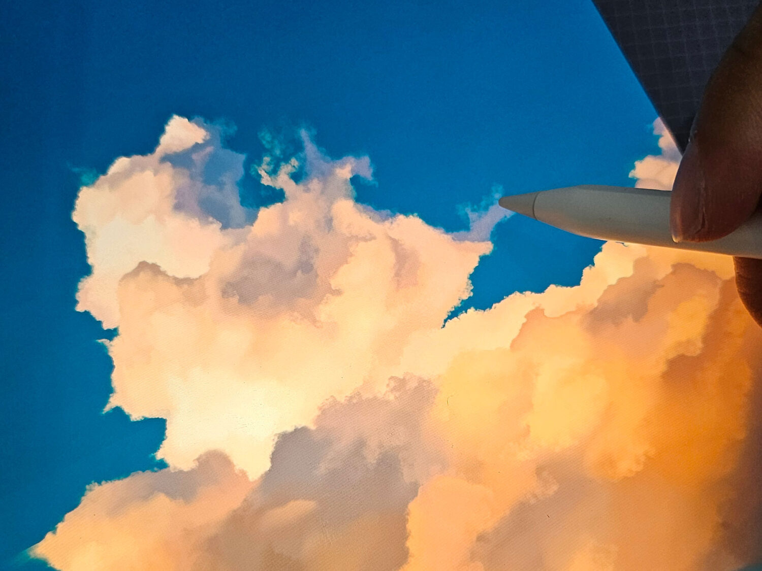
As most of you will know, most of Quinn’s world is drawn in Adobe Illustrator. It’s precise, clean and lets us create artworks that can be resized to fit a postage stamps or towering billboards, with no loss of quality. But skies? You can’t really paint skies in Illustrator. At least, not in the way we want them.
For years, we used gradients. And of course, we still love them. There’s something incredibly elegant about the way they bleed from one colour to another and compress so much emotion and depth into one sweeping chromatic wash. However, when you’ve created as many illustrations as we have, eventually gradients just aren’t enough. We found ourselves wanting more. Was there a way to capture even more feeling and subtle shifts in weather? We wanted to create skies that looked like it might rain or ones that were 20 minutes after sunset (which is called Optimum Colour Time and the best time for a sunset).
No matter how hard we tried, we weren’t able to create them with just Adobe Illustrator alone.
And so, we started learning to paint in Procreate.
We’d tried digital painting before but never quite got it to work in the past. The biggest problem was obviously due to technique. However, what we also realised was that we were trying to blend vector’s cleanness with digital painting’s looseness and in doing so, we compromised both. What we learned was to stop forcing the styles together. Instead, we embraced their differences.
Vector is deliberate and geometric. Paint is soft and intuitive. The tension between them is what makes it interesting. We realised we didn’t need to change the look of Quinn’s world completely. We just needed to let the light in differently.
For the Post Office of Dead Letters, the sky has to carry the emotional weight. The sky sets the lighting for the scene undoubtedly but it also shapes the emotional resonance. It needed to feel wide enough for a feeling to get lost in.
Drawing the Post Office
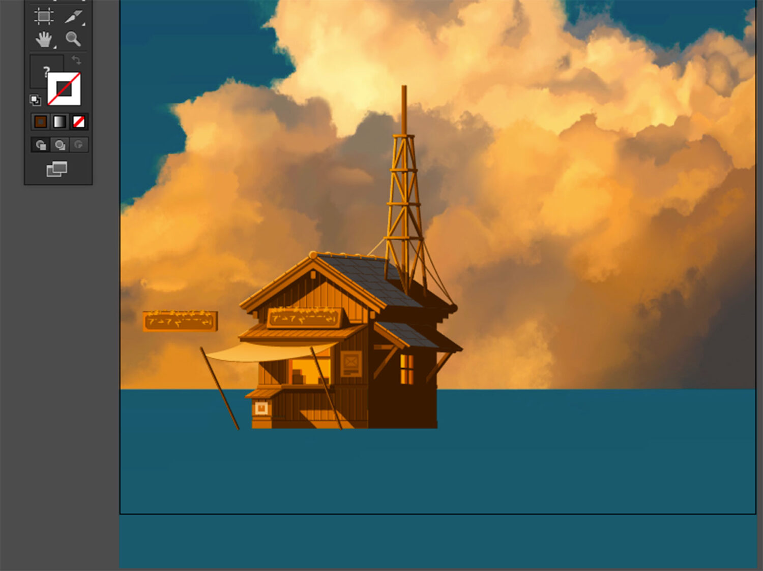
Once the sky was painted, we brought the piece into Adobe Illustrator to begin drawing the post office.
While skies are emotional, everything else, such as buildings, signs and even the ground, comes from structure and precision. This is the hallmark of a Quinn the Fox illustration.
Our background is in architecture and that thinking never really leaves you. Even if it’s a fictional building, we always start by thinking about how the building might work and how it feels to be inside it.
Heath Robinson inspires a lot of our illustrations, including the Post Office of Dead Letters. His illustrations have a beautiful futility to them: overly elaborate contraptions, built with care, to achieve something seemingly insignificant. That felt perfect for the Post Office of Dead Letters. A machine made for messages that may never be read.
However, unlike many fictional architectural illustrations, we didn’t want the post office to feel dystopian, industrial or post apocalyptic in any way. We wanted something small and familiar, like a log cabin that had been repurposed or a building that had been constructed out of necessity, rather than meticulously planned.
We added a makeshift wind engine ramshackled onto the main building to suggest a way that these letters might travel. Perhaps they are scattered into the wind, carried symbolically to those they were meant for. Even if it’s an impossible, or even futile idea, we wanted to create a sense that someone, somewhere, tried very hard to make the unworkable work.
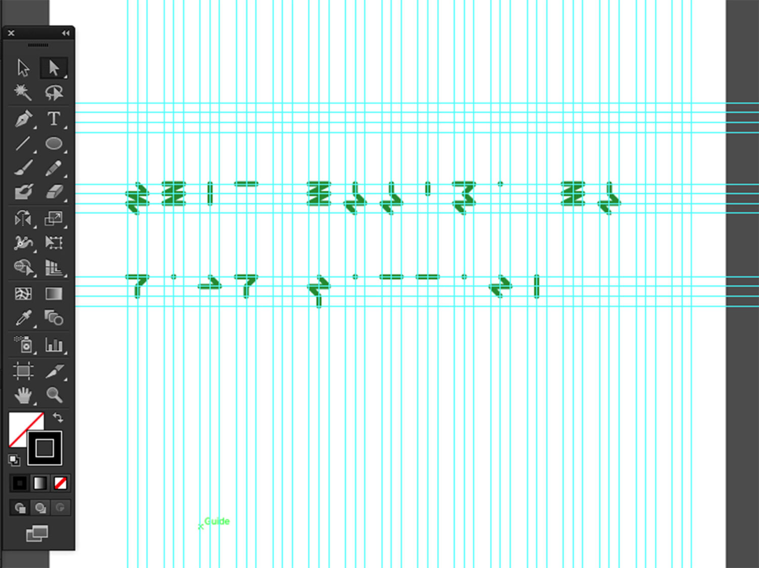
To make the post office feel part of a real world, we also created a written language. We use it across the sign and in other parts of Quinn’s world. It is a visual code that is unreadable to most but always consistent. This doesn’t just make the world feel real, it makes it feel lived in.
Sketching Without Sketches
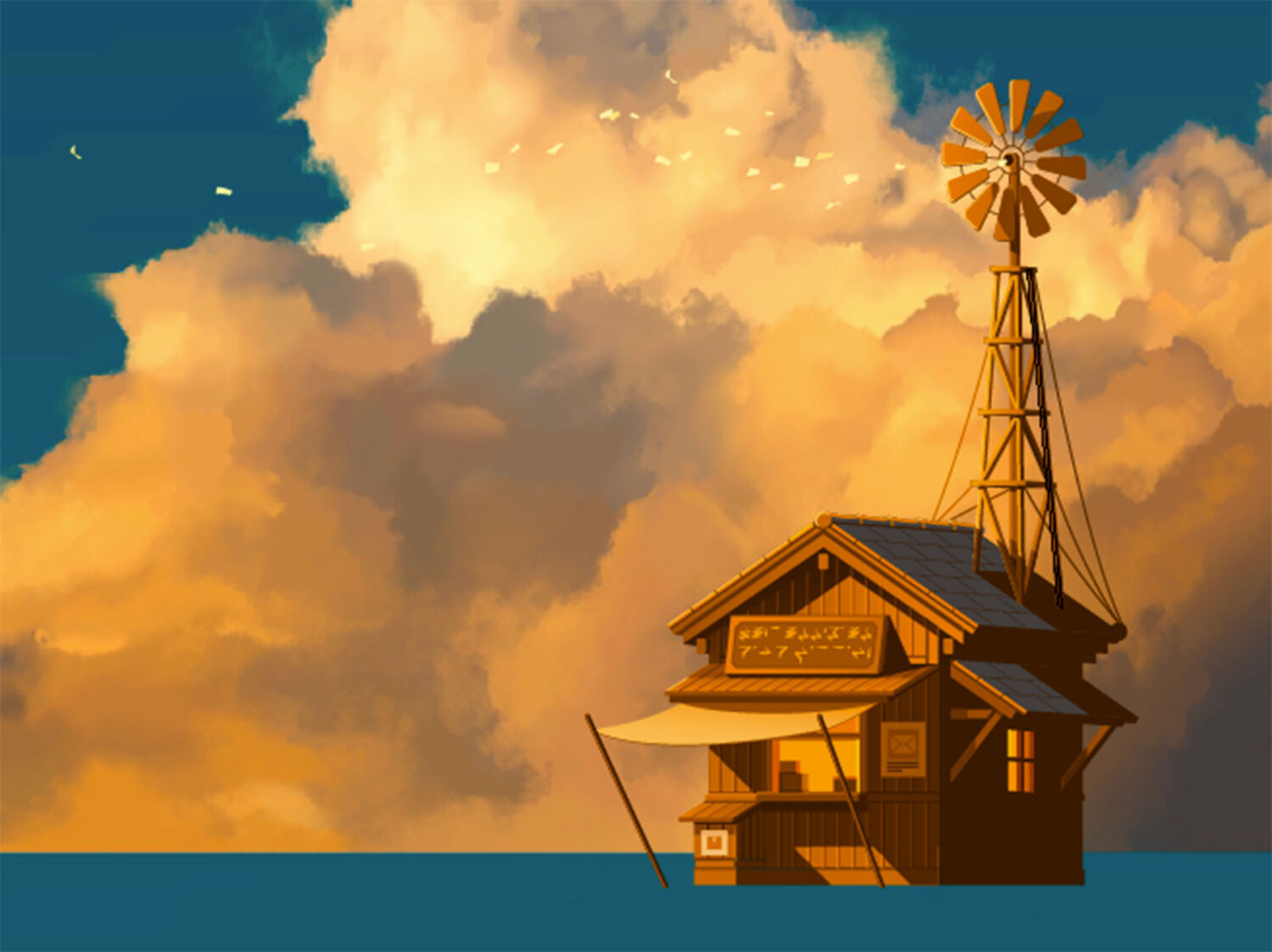
People often assume that illustrations like this start with pages of sketches. But truthfully, we very rarely sketch at all. Since patience is not one of our virtues, most of the time, we just begin. This way of working is not for everyone and sometimes it works and sometimes it doesn’t. However, we would much rather that than spends hours (if not days) planning everything out.
We firmly believe that artists, indeed all humans, should learn to trust their gut. Of course, it’s important to learn about golden ratios and technique but for us, it’s more important that a composition feels right rather than one that follows a formal plan.
This means things often move around. A LOT. Sometimes we’ll lay down a shape that doesn’t work, only to return to it hours later and realise it was right all along.
In fact, when we first started the Post Office of Dead Letters, the building sat on the left-hand side of the frame. It stayed there for quite some time. But as the piece grew, it just didn’t feel balanced. So we moved it to the right.
We trust the feeling more than the formula. The beauty of digital art is that you can always let the composition change its mind. There’s a sort of choreography to drawing this way. One piece of the puzzle lands and the others move in response. It’s not the most efficient way to draw, we grant you, but it feels alive.
Drawing Lush Grass Fields
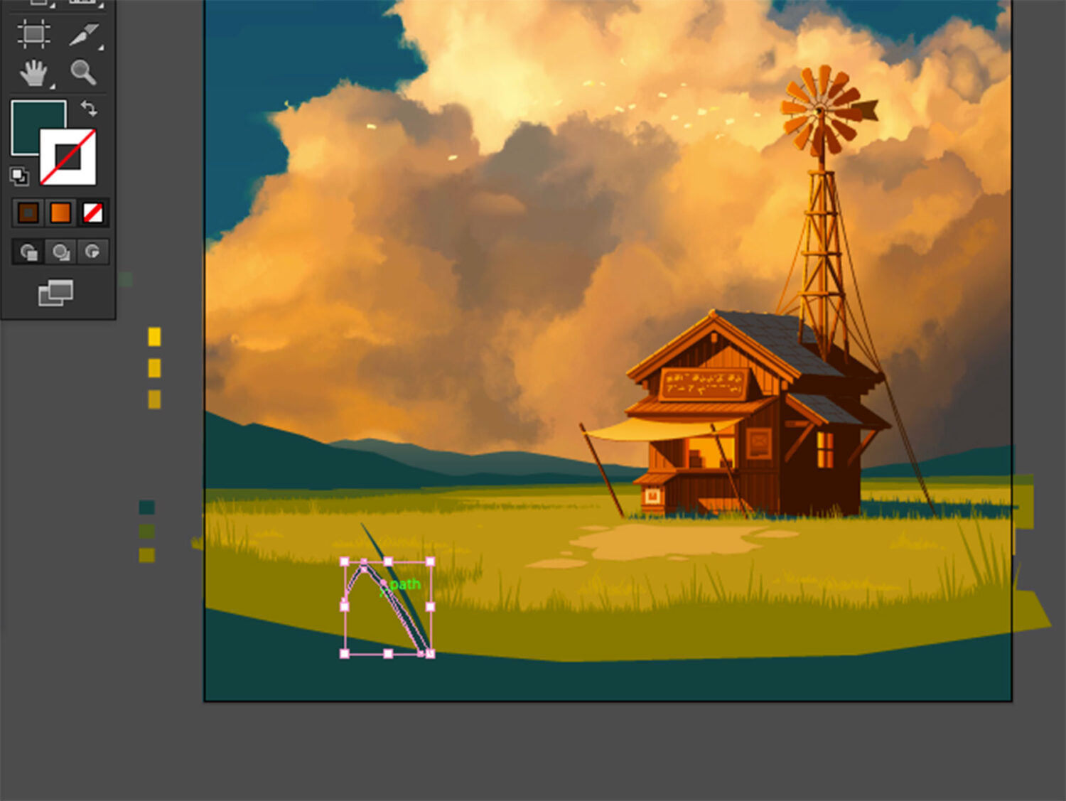
Grass is one of those things that’s easy to overlook. However, it can be used to capture movement and a sense of wind and openness.
We used to rely on flat colours or gradients for fields, which served their purpose but they never quite captured the mood we were looking for. There was no texture or movement – just a green shape pretending to be a meadow.
So we changed the way we draw grass.
Each blade is drawn by hand. There’s no brush tool. No automatic scatter. It’s just a slow layering of hundreds of individual lines. It’s a quiet and almost ritualistic process, but one that makes the scene feel more alive. There is a sense of comfort in repetitive and familiar motion – it almost feels quite relaxing whilst you’re doing it.
The style was inspired by the video game, The Legend of Zelda: Breath of the Wild. The way it builds its fields using three flat tones (a light, a mid and a shadow) is deceptively simple but incredibly effective. It creates depth and a subtle richness without being distracting.
Like the sky, the grass in this scene holds emotion too. It’s not just a background. It’s part of the feeling.
Finding Quinn and the Little White Cat
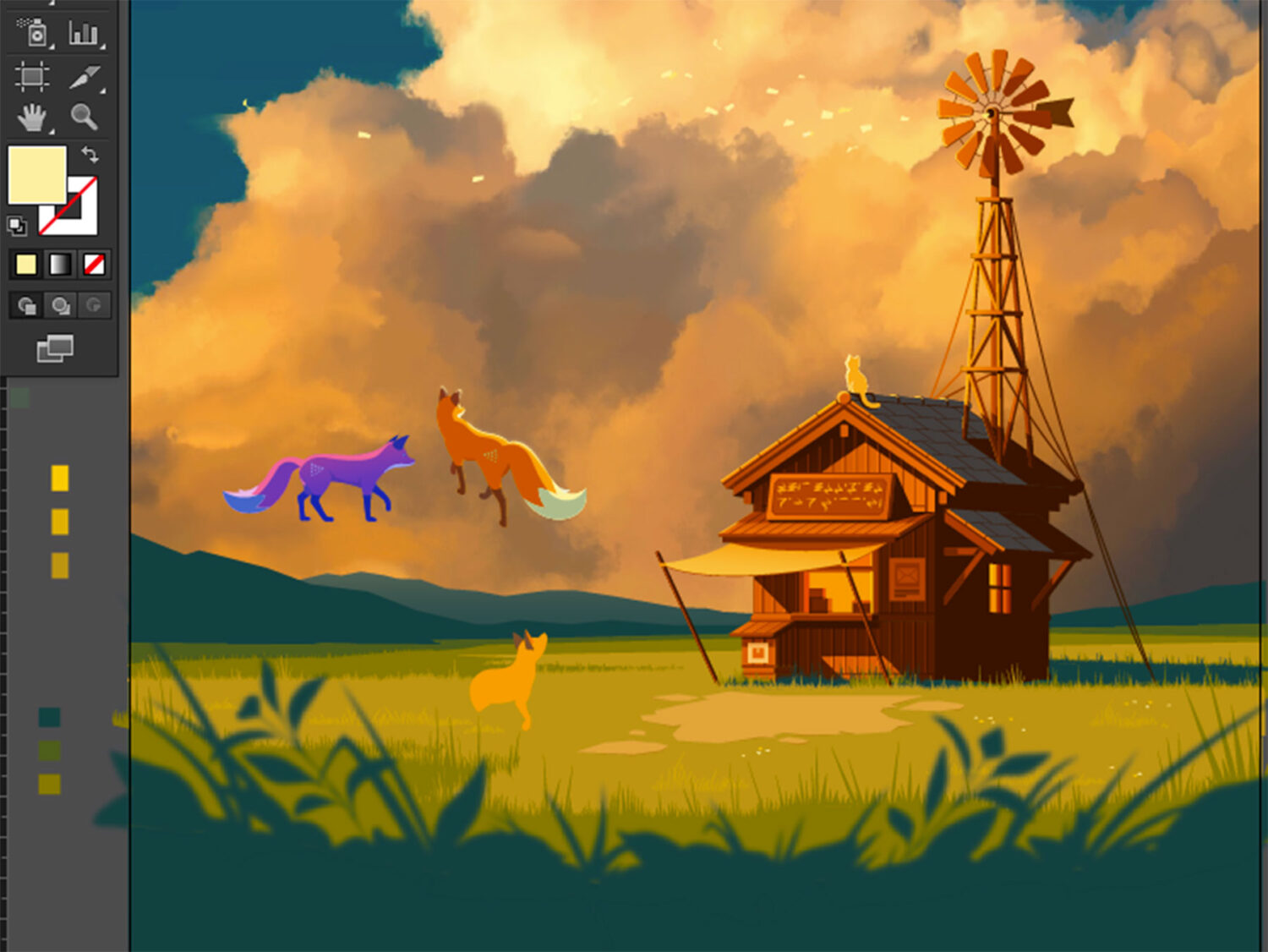
We’ve been drawing Quinn the Fox for over a decade and we know him inside and out. Still, every time we draw him, we refer back to older illustrations. It’s important to make sure he feels the same. The proportions need to be right. His posture needs to hold the same quiet confidence. The world can move around him but Quinn should always feel like Quinn.
Look very closely and you’ll see the white cat that runs the Post Office of Dead Letters sitting on the roof. You might not notice him at first and that’s absolutely deliberate.
We like it when people have to look more closely. That’s the spirit behind Quinn the Fox. Grand gestures are nice and impressive but they rarely endure. They set too high a bar and you’re forced to chase ever grander gestures just to feel content. However, if you can learn to see beyond the everyday, there is a wealth of happiness and wonder to be uncovered that is far more achievable and longer lasting.
That is why Quinn the Fox’s motto is “Beyond the Everyday”.
Conclusion: New Ways of Saying Things
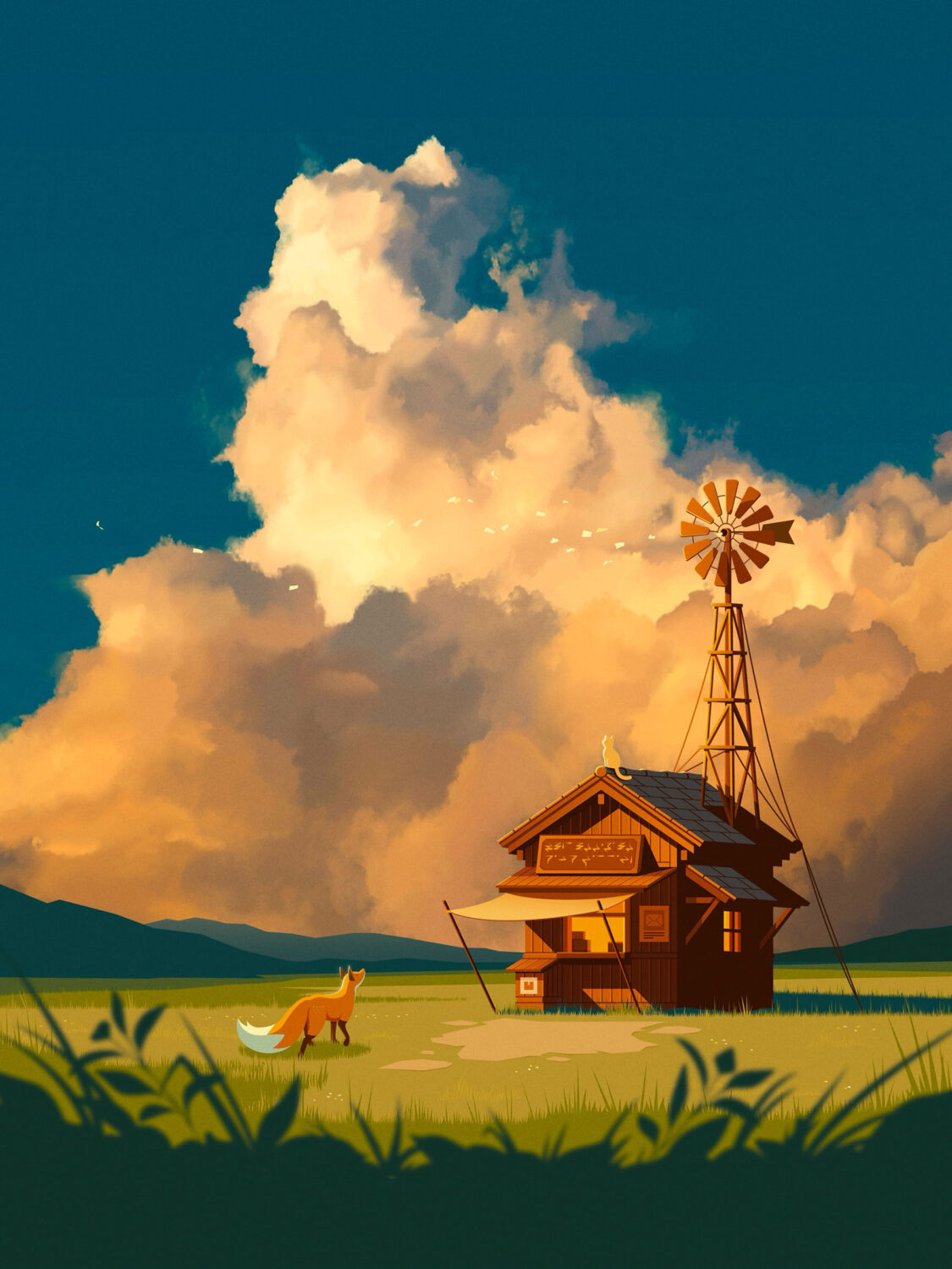
We’ve been building Quinn’s world for over a decade. You might think that after so long, everything would be fixed in place. But it isn’t. We’re still finding new ways to draw it and for you to feel it.
We created the Post Office of Dead Letters as a love letter to saudade (a Portuguese word that describes a deep, melancholic longing for something or someone that may never return). Most people can relate to the feeling of something left unsaid or a moment they wish they could return to. If you have something you wish you’d said or feelings of hope or longing left unresolved, you can send it to us. We’ll read every letter. With your permission, we may feature some and add them to the public archive. Send your letters to:
Quinn the Fox
Unit 13A, Building Two
Canonbury Yard
190A New North Road
London
N1 7BJ
UK
Feeling inspired? Perhaps it’s time to write something of your own. We make fox stationery for moments just like this. Explore the full Quinn the Fox range and find a page for the words you’ve been meaning to write.